Vigil
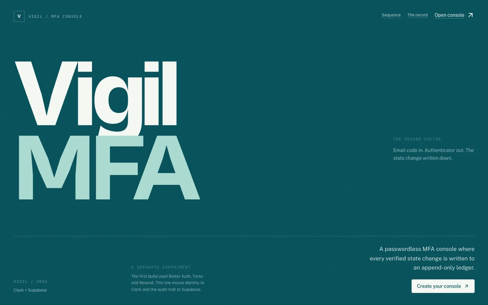
A multi-factor authentication console for teams — enrolment, recovery, device trust, and an audit trail that reads like a sentence.
Stack Next.js · TypeScript · Clerk · Supabase · Tailwind CSS
Most authentication products are built for the moment of login. Vigil is built for the other 364 days: the device someone lost, the intern who changed phones, the recovery code that nobody can find, the audit that arrives six months later.
It is a multi-factor authentication console for small teams. Clerk handles the identity primitives. Supabase holds the operational record. The interface is the part I care about: it turns security state into something an operator can read without opening three dashboards.
The problem with a wall of toggles
Security settings tend to fail in two directions. Either they are so abstract that nobody turns them on, or they are so granular that only the person who configured them understands the result. Both outcomes produce the same thing: a workspace that looks protected and is not.
Vigil starts from a sentence instead of a switch. Require a second factor for everyone in this workspace. Let this device skip the challenge for seven days. Send recovery to the owner before the backup address. Each control has a state, a consequence, and a short explanation next to it. The interface never asks the operator to infer what a toggle does from its label.
The build
The app is a Next.js App Router project with server components for the read paths and small client islands for enrolment and recovery. Clerk owns the identity lifecycle; the application owns the policy layer. Supabase stores the events that Clerk does not: device approvals, recovery attempts, factor changes, and the operator who made each decision.
The audit view is deliberately plain. Every row answers four questions — who, what, when, and from where — and links to the object it changed. No charts. No severity colour scheme that requires a legend. A security log is a document, not a dashboard.
NOTE
The recovery flow is the part I tested most. A second factor that cannot be recovered is a lockout with better branding.
What I would keep
The design constraint was useful: every screen had to be explainable in one sentence to someone who had never seen the product. That rule removed a lot of settings, a few clever abstractions, and almost every modal. What remained was a console that behaves like a careful colleague: it tells you what it knows, what it needs, and what happens next.
The next version would add organisation-level policy templates and a proper invitation flow. The current build is the argument: authentication can be legible without being shallow.
More from the build
Click any image. Arrow keys walk the set.