StartX
StartX is a launch surface for early-stage ideas — a single story, a clear ask, and an interface that gives the work room to be taken seriously.
Stack Next.js · TypeScript · Motion · Tailwind CSS
Most startup pages are optimised for the moment of the pitch. StartX is designed for the moment before: the founder with an idea, a working demo, and no clean way to explain why any of it matters.
The product is a launch surface. A founder gets one page, a small set of prompts, and a structure that forces the story into order: the problem, the insight, the thing that exists now, and the next honest step. No growth funnel. No investor theatre. Just a page that can be sent to someone whose attention is expensive.
The shape of the page
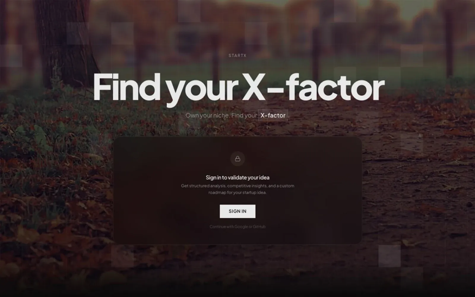
The landing page is deliberately dark. Not because dark means serious, but because the product is usually shown as a screenshot against a bright desktop, and the contrast makes the artifact the first thing you see. The interface is mostly typography and space. One accent. One action.
The sign-in path is the only real funnel, and it is kept small: an email, a magic link, a project name. The rest of the product is a single editor with a live preview. The preview is the point. Founders can see the page they are making, at the width a reader will see it, without a separate publishing step.
The build
Next.js and TypeScript with Motion for the few transitions that carry meaning: the hero resolving on load, the preview updating when a field changes, the publish confirmation. Everything else is static. The content model is intentionally narrow — a project has a story, a link, a status, and a contact — because the hardest part of the product is helping someone decide what not to say.
TIP
The best launch page I have seen had four sentences and one screenshot. The constraint is the feature.
What I would keep
The empty preview. Before a founder types anything, the page shows a complete example with the labels visible. It teaches the structure without a tutorial, and it makes the first edit feel like editing rather than filling a form. That is the whole product in one screen.
More from the build
Click any image. Arrow keys walk the set.